How to Build a Responsive One Fold Accordion Using Purely TailwindCSS
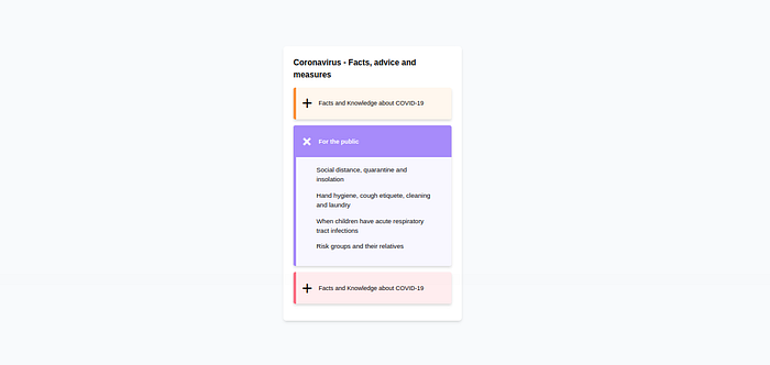
In web design, an accordion is a type of menu that displays a list of headers stacked on top of one another. When clicked on (or triggered by a keyboard interaction or screen reader), these headers will either reveal or hide associated content.
This design pattern is ideal for breaking down long-form or complex content into digestible chunks. It’s also ideal for mobile sites since it reduces how much a user has to scroll. This kind of component is commonly used on a FAQ page of a website.
This gives people control over what to read, and when, which can enhance their user experience.
In this Section, we will be building one of these amazing One Fold Accordion components purely using TailwindCSS.
Understanding the Task
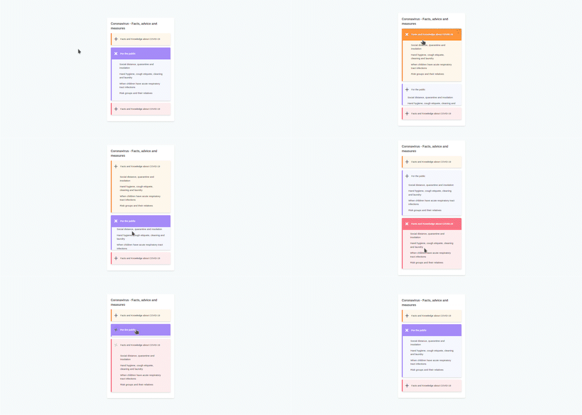
You might be wondering, what’s a one-fold accordion? This is simply one where you can read the content of one accordion at a time.
When you open(Unfold) one, the other folds itself automatically. And we will be building this using TailwindCSS only.
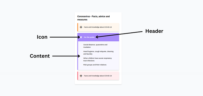
As with every other accordion, it consists of 3 parts.
- Header
- Icon
- Content
Let’s get to see how this is built.
Structure of Code
Since the accordion consists of multiple identical folds, we will focus on one, then simply coping and paste, and change the content for the others.
Here is how our code will be structured,
<body>
<!-- First Layer-->
    <div>
<!-- Second Layer-->
        <div>
                    <!-- Main Header -->
                        <div></div>
                    <!-- Accordion Container -->
                    <div>
                    <!-- FOld one -->
                        <div></div>
                    <!-- Fold two -->
                        <div></div>
                    <!-- Fold three -->
                        <div></div>
                    <div>
        </div>
    </div>
</body>
As earlier mentioned, we will focus one fold, then modify it accordingly to suit the others
Code of one Fold
<!-- Fold One-->
<div class="my-[0.8rem] overflow-hidden border-l-[0.4rem] border-orange-400 bg-orange-200/20 shadow-md rounded">
<input type="radio" name="faq" id="faq_1" class="sr-only peer">
<label for="faq_1" class="peer-checked:[&>section]:font-semibold peer-checked:[&>section]:bg-orange-400 peer-checked:[&>section]:text-white peer-checked:[&>section>div>h2]:rotate-45 peer-checked:[&>div]:max-h-screen peer-checked:[&>div]:p-[1rem]">
<!-- Header-->
<section class="p-[0.7em] cursor-pointer flex items-center bg-transparent gap-3">
<!-- Icon -->
<div class="text-4xl flex items-center justify-center">
<h2 class="block rotate-0 transition-all duration-200">+</h2>
</div>
<h2 class="w-[80%] text-xs">Facts and Knowledge about COVID-19</h2>
</section>
<!-- Accordion Content -->
<div class="max-h-0 mx-7 p-[0.001rem] [&>p]:mb-3 transition-all duration-[1s] text-[0.8rem]">
       <p>Social distance, quarantine and insolation</p>
       <p>Hand hygiene, cough etiquete, cleaning and laundry</p>
       <p>When children have acute respiratory tract infections</p>
       <p>Risk groups and their relatives</p>
</div>
</label>
</div>Let’s understand the code we just wrote. we will discuss the different parts first, then we will talk about how we made this functional.
Header
Principally our header just contains a text whose width is w-[80%], that’s 80% of the parent container. It is important to emphasize that its parent container is a flex container containing both the header and the icons.
<h2 class="w-[80%] text-xs">Facts and Knowledge about COVID-19</h2>Icons
Here, to avoid imports or adding SVG files, we just used ASCII values to add “+” and rotate it depending on the state of the accordion, and it just serves the purpose of our task.
<!-- Icon -->
<div class="text-4xl flex items-center justify-center">
<h2 class="block rotate-0 transition-all duration-200">+</h2>
</div>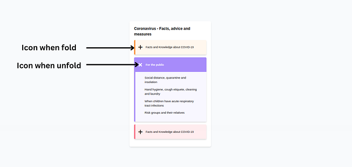
Both the header and the icon are found in the same container (Same section). So from our code, we grouped them together.
<!-- Header-->
<section class="p-[0.7em] cursor-pointer flex items-center bg-transparent gap-3">
<!-- Icon -->
<div class="text-4xl flex items-center justify-center">
<h2 class="block rotate-0 transition-all duration-200">+</h2>
</div>
<h2 class="w-[80%] text-xs">Facts and Knowledge about COVID-19</h2>
</section>We didn’t apply much styling here, just gave the container a padding of p-[0.7rem], background-color of bg-transparent, and since it is a flex container, we gave it's content a gap of gap-3
Accordion Content
<!-- Accordion Content -->
<div class="max-h-0 mx-7 p-[0.001rem] [&>p]:mb-3 transition-all duration-[1s] text-[0.8rem]">
<p>Social distance, quarantine and insolation</p>
<p>Hand hygiene, cough etiquete, cleaning and laundry</p>
<p>When children have acute respiratory tract infections</p>
<p>Risk groups and their relatives</p>
</div>We didn’t do much styling here, we gave it a max-height of max-h-0, padding of p-[0.001rem] and a margin-inline of mx-7
Please note this max-h-0 and p-[0.001rem] carefully as we will need this particular property soon
This is basically the structure of an accordion.
Now! How do we make it functional?
We achieve this with the help of two things, an input checkbox and a label.
- We grab all of our accordions into the labels, and we use the state of the radio input to alter the characteristics of other properties.
<input type="radio" name="faq" id="faq_1" class="sr-only peer">
<label for="faq_1" class="peer-checked:[&>section]:font-semibold peer-checked:[&>section]:bg-orange-400 peer-checked:[&>section]:text-white peer-checked:[&>section>div>h2]:rotate-45 peer-checked:[&>div]:max-h-screen peer-checked:[&>div]:p-[1rem]">
For the first accordion, we gave it a name=”faq_1" and id=”faq_1". it is important to also give the properties sr-only and peer to the input field.
Peer class adds functionality to a website in HTML. It’s almost like JS where things work using an input radio. It depends on what the value of the input is set to.
While Screen-reader-only elements (sr-only) hide an element visually without hiding it from screen readers:
I believe these two classes make a lot more sense now.
We made use of peer-checked to alter different properties within the label component. For example, peer-checked:[&>section]:text-white peer-checked:[&>section]:bg-orange-500, simply means, if the radio button is checked, change the text color of the section part to text-white, and also background-color to bg-orange-500
Similarly, we also use peer-checked:[&>section>div>h2]:rotate-45, saying that, if the radio button is checked, rotate our "+" icon 45deg, giving us that "x" when the accordion is unfolded.
Do you remember our max-h-0? We made use of the same logic above to change its value, peer-checked:[&>div]:max-h-screen , On checked, change max-h-0 to max-h-screen
The same idea goes for all the others.
It is worth noting that, you can not change properties that weren’t initially defined. For example, You can challenge the background-color of the section part if the section part didn’t have bg-white.
If max-h-0 was not defined or was named something else like min-h-0 or just h-0, the peer-checked won't work.
And that’s basically how you can build an accordion using TailwindCSS.
Of Course, this was just one of the 3 accordions, this is how the whole code looks like,
<div>
<div class="my-[0.8rem] overflow-hidden border-l-[0.4rem] border-orange-400 bg-orange-200/20 shadow-md rounded">
<input type="radio" name="faq" id="faq_1" class="sr-only peer">
<label for="faq_1" class="peer-checked:[&>section]:font-semibold peer-checked:[&>section]:bg-orange-400 peer-checked:[&>section]:text-white peer-checked:[&>section>div>h2]:rotate-45 peer-checked:[&>div]:max-h-screen peer-checked:[&>div]:p-[1rem]">
<section class="p-[0.7em] cursor-pointer flex items-center bg-transparent gap-3">
<div class="text-4xl flex items-center justify-center">
<h2 class="block rotate-0 transition-all duration-200">+</h2>
</div>
<h2 class="w-[80%] text-xs">Facts and Knowledge about COVID-19</h2>
</section>
<div class="max-h-0 mx-7 p-[0.001rem] [&>p]:mb-3 transition-all duration-[1s] text-[0.8rem]">
<p>Social distance, quarantine and insolation</p>
<p>Hand hygiene, cough etiquete, cleaning and laundry</p>
<p>When children have acute respiratory tract infections</p>
<p>Risk groups and their relatives</p>
</div>
</label>
</div>
<div class="my-[0.8rem] overflow-hidden border-l-[0.4rem] border-violet-400 bg-violet-200/20 rounded shadow-md">
<input type="radio" name="faq" id="faq_2" class="sr-only peer" checked>
<label for="faq_2" class="peer-checked:[&>section]:font-semibold peer-checked:[&>section]:bg-violet-400 peer-checked:[&>section]:text-white peer-checked:[&>section>div>h2]:rotate-45 peer-checked:[&>div]:max-h-screen peer-checked:[&>div]:p-[1rem]">
<section class="p-[0.7em] cursor-pointer bg-transparent flex items-center gap-3">
<div class="text-4xl flex items-center justify-center">
<h2 class="rotate-0 transition-all duration-200">+</h2>
</div>
<h2 class="w-[80%] text-xs">For the public</h2>
</section>
<div class="max-h-0 mx-6 p-[0.001rem] [&>p]:mb-3 transition-all duration-[1s] text-[0.8rem]">
<p>Social distance, quarantine and insolation</p>
<p>Hand hygiene, cough etiquete, cleaning and laundry</p>
<p>When children have acute respiratory tract infections</p>
<p>Risk groups and their relatives</p>
</div>
</label>
</div>
<div class="my-[0.8rem] overflow-hidden border-l-[0.4rem] border-rose-400 bg-rose-300/20 shadow-md rounded">
<input type="radio" name="faq" id="faq_3" class="sr-only peer">
<label for="faq_3" class="peer-checked:[&>section]:font-semibold peer-checked:[&>section]:bg-rose-400 peer-checked:[&>section]:text-white peer-checked:[&>section>div>h2]:rotate-45 peer-checked:[&>div]:max-h-screen peer-checked:[&>div]:p-[1rem]">
<section class="p-[0.7em] cursor-pointer flex items-center gap-3">
<div class="text-4xl flex items-center justify-center">
<h2 class="block rotate-0 transition-all duration-200">+</h2>
</div>
<h2 class="w-[80%] text-xs">Facts and Knowledge about COVID-19</h2>
</section>
<div class="max-h-0 mx-7 p-[0.001rem] [&>p]:mb-3 transition-all duration-[1s] text-[0.8rem]">
<p>Social distance, quarantine and insolation</p>
<p>Hand hygiene, cough etiquete, cleaning and laundry</p>
<p>When children have acute respiratory tract infections</p>
<p>Risk groups and their relatives</p>
</div>
</label>
</div>
</div>We obviously added some styling to the different layers of the different and to the body in order to achieve the end product as thus,
<body class="bg-slate-50 flex items-center justify-center min-h-screen">
<!-- First Layer -->
    <div class="w-[22rem] p-5 bg-white rounded-md shadow-md">
<!-- Second Layer -->
        <div>
                    <!-- Main Header -->
            <div class="font-bold">
                <h2>Coronavirus - Facts, advice and measures</h2>
            </div>
            <!-- Accordion Container -->
                    <div></div>
        </div>
       </div>
</body>
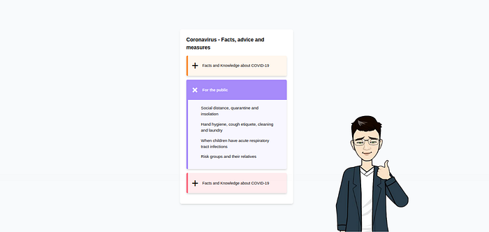
And that’s pretty much all about it.
Conclusion
We just built a fully functional One Fold Accordion Component and in the process, we also had more insight about Tailwindcss.
Many employers will need such components to be added to their websites, and for sure you know how simple it is to create it straight from your HTML document.
You can have a Live preview on Codepen or find the code on GitHub
Don’t hesitate to share with me if you were able to complete the tutorial on your end, I’d be happy to see any additional components.
If you have any worries or suggestions, don’t hesitate to bring them up! 😊
See ya! 👋

